Workflow Forms are interactive forms that are populated in the Presence module while a call is active. They allow for in-depth analytics by incorporating Workflow Tags and Workflow Webhook Configurations that are tied to the CDR of the call.
Setting Up and Maintaining Workflow Forms
To modify/create workflow forms in your system, you must have the proper permissions to the module as an administrator. The forms are accessed via the Kerauno Dashboard > Workflow Tools > Workflow Forms module.
Your dashboard may be empty but could look similar to Figure 01 below.
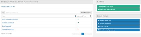 Figure 01: Workflow Forms
On the top-right, click the or
or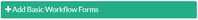 button.
Advanced Workflow Forms include the ability to include pre- and post-webhooks (see Workflow Condition Configurations for more information).
You will be prompted to add a name for the workflow. Click the button to save.
Click the name from your dashboard to open the Management page.
When a field is selected from the right, it will be added to the bottom of the form. You also have the option to drag a field onto the form and place it where you prefer it to be inserted. When adding a field, the previous field's edit view will minimize and the edit view for the new field will be displayed.
While the Edit view is open on any field, you can click the Close button to minimize the Edit view and see what that field will actually look like in a live workflow form.
Field Configuration can be added to any field by clicking the button. You will be prompted to select from viewing options (show, hide, required, not required) and to select a condition (see Workflow Condition Configurations). Multiple conditions can be added.
When the Edit view is closed on any field, you can open the Edit view by hovering over the field; a series of three buttons will display on the right side:
- Edit: Opens the Edit view.
- Copy: Duplicates the selected field (including all data already saved in that field).
- Remove: Removes the selected field from the Workflow Form.
| NOTE: | This cannot be undone; the entire field will change to a shade of red when this button is hovered over, make sure you really want to remove this field. |
The order of the fields can be changed by dragging and dropping a field to a different location on the Workflow Form.
The following form fields will be available to add to your form:
- Header is a label that will show on the Workflow Form itself; it does not take any input from the user. You can change the size of the Header by selecting a font type; h1 is the largest header size available while h3 is the smallest header size available.
- Paragraph is a block of text that will show on the Workflow Form itself; it does not take any input from the user. You can change the way that the text appears on the form by selecting an option in the Type drop-down.
- Text Field is an input field meant to receive small amounts of data. The field will appear as a single line-wide box.
- Required will invalidate the form while the input is blank if this option is selected.
- Label is the label that will appear above the input field on the Workflow Form.
- Tag is the Workflow Tag that is associated with this text field; this data will be searchable in the analytics. Workflow Tags, and Components, are variables (cannot contain underscores) in the Presence Screen-Pop functionality. You can either select from a previously created Workflow Tag or you can create a new Workflow Tag.
- Type will set the type of input that the field will accept.
- Max Length is the maximum number of characters the field will accept.
- Text Areas are input fields that accept larger amounts of data; the field will appear as a seven line-wide box.
- Required will invalidate the form while the input is blank if this option is selected.
- Label is the label that will appear above the input field on the Workflow Form.
- Tag is the Workflow Tag that is associated with this text field; this data will be searchable in the analytics. Workflow Tags, and Components, are variables (cannot contain underscores) in the Presence Screen-Pop functionality. You can either select from a previously created Workflow Tag or you can create a new Workflow Tag.
- Type will set the type of input that the field will accept.
- Max Length is the max number of characters the field will accept.
- Select fields are input fields that populate a drop-down from the set options.
- Required will invalidate the form while the input is blank if this option is selected.
- Label is the label that will appear above the input field on the Workflow Form.
- Tag is the Workflow Tag that is associated with this text field; this data will be searchable in the analytics. Workflow Tags and Components are variables (cannot contain underscores) in the Presence Screen-Pop functionality. You can either select from a previously created Workflow Tag or you can create a new Workflow Tag.
- Options are the manually input options that will be available to the user for selection.
- The first input (left column) is the visual label that will be seen by the user.
- The second input (right column) is the value that will be stored in the database; this value can contain no spaces.
- The default number of options is 3, but more may be added by clicking the
 button.
 button.
- Option List can be set to an option sent through a webhook. If there is nothing that matches what is in the Option List, the Workflow Form will default to the options that were manually input.
- Checkbox Groups are input fields that allow for the selection of multiple options.
- Required will invalidate the form while the input is blank if this option is selected.
- Label is the label that will appear above the input field on the Workflow Form.
- Tag is the Workflow Tag that is associated with this text field; this data will be searchable in the analytics. Workflow Tags, and Components, are variables (cannot contain underscores) in the Presence Screen-Pop functionality. You can either select from a previously created Workflow Tag or you can create a new Workflow Tag.
- Inline will display the checkbox in line with the option.
- Options are the manually input options that will be available for selection to the user.
- The first input (left column) is the visual label that will be seen by the user.
- The second input (right column) is the value that will be stored in the database; this value can contain no spaces.
- The default number of options is 3, but more may be added by clicking the
 button.
 button.
- Radio Groups are input fields that allow for the selection of a single option.
- Required will invalidate the form while the input is blank if this option is selected.
- Label is the label that will appear above the input field on the Workflow Form.
- Tag is the Workflow Tag that is associated with this text field; this data will be searchable in the analytics. Workflow Tags and Components are variables (cannot contain underscores) in the Presence Screen-Pop functionality. You can either select from a previously created Workflow Tag or you can create a new Workflow Tag.
- Inline will display the radio inline with the option if this is selected.
- Options are the manually input options that will be available for selection to the user.
- The first input (left column) is the visual label that will be seen by the user.
- The second input (right column) is the value that will be stored in the database; this value can contain no spaces.
- The default number of options is 1, but more may be added by clicking the
 button
 button
- Number fields are input fields that receive numerical values only.
- Required will invalidate the form while the input is blank if this option is selected.
- Label is the label that will appear above the input field on the Workflow Form.
- Tag is the Workflow Tag that is associated with this text field; this data will be searchable in the analytics. Workflow Tags and Components are variables (cannot contain underscores) in the Presence Screen-Pop functionality. You can either select from a previously created Workflow Tag or you can create a new Workflow Tag.
- Min is the minimum numerical value that will be accepted.
- Max is the maximum numerical value that will be accepted.
- Date Fields are input fields that receive date information only. A date picker will populate when this field is clicked during an active Workflow Form.
- Required will invalidate the form while the input is blank if this option is selected.
- Label is the label that will appear above the input field on the Workflow Form.
- Tag is the Workflow Tag that is associated with this text field; this data will be searchable in the analytics. Workflow Tags and Components are variables (cannot contain underscores) in the Presence Screen-Pop functionality. You can either select from a previously created Workflow Tag or you can create a new Workflow Tag.
- Next Form fields are a button that will become enabled when all required fields have been completed and will populate the next form once clicked.
- Required will disable the submit button on the form if this option is selected; the user would be required to continue on to the next form before being able to submit the data.
- Label is the label that will appear on the button on the Workflow Form.
- Make sure to add Go To Configuration settings for this button to work properly (see Next Form Functionality for more information).
Once you have added the desired fields and completed all of the settings, click the button to add it to the system.
Congrats! You now have a functioning Workflow Form in your Kerauno Workflow Platform.
String Injection in the Paragraph Field
Within the Paragraph field, while the Type is set as 'p', you can take advantage of string injection. Using this functionality allows you to dynamically input data into your form to better assist your agents.
To use this functionality, you need to include the following text to allow the system to perform the string injection: ${workflow_tag_name} where 'workflow_tag_name' is the value assigned to the Workflow Tag that you desire to be injected into the text.
You may have a Workflow Form that looks similar to the example in Figure 02 below.
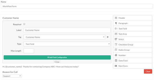 Figure 02: Workflow Form
When you are on the active call using this workflow, as you input data into the Customer Name field, that data will automatically be injected into your Paragraph field. Before data is input, it could look similar to Figure 03 below.
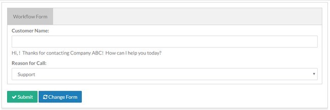 Figure 03: Workflow Form Prior to String Injection
After string injection, it would look similar to Figure 04 below.
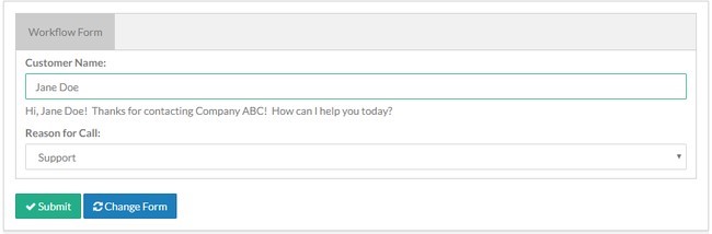 Figure 04: Workflow Form After String Injection
Using this functionality will enable you to provide visual cues to your agents. This is extremely helpful when the paragraph field is being used for scripting; the agent doesn't need to try to find the information elsewhere on the page, it can be automatically inserted into the script. This is also functional for use with multiple forms, where the tag information is set and you can reference a tag from a previous form in a future form using string injection.
